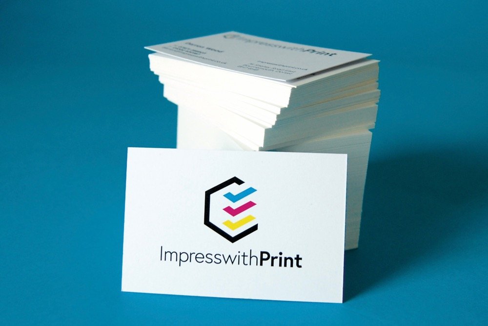
Spot colours are pre-mixed inks for when colour consistency across your brand is essential.
If you’re not sure what ‘spot colour‘ really means, and would like to learn more, then please visit this page: Spot Colours Explained
Spot Colour Business Cards FAQ’s
Generally, no! Some colours are fairly representative whereas others are a long way off. The monitor you view your proof on is a device that mixes colours using red, green and blue (RGB).
Without getting too technical, if your monitor has not been calibrated to display a Pantone® colour, then it’s unlikely you will see an accurate representation.
If choosing one or more specific spot colours (for branding purposes etc.) then it’s essential the colours are chosen from a printed Pantone® swatch, unless you know your screen is accurately calibrated.
An example – if you were to select Pantone® Violet in your graphics program, it’s very likely that this will show as a ‘blue’ onscreen. If you were then to look at Pantone® Violet in a Pantone® swatch you’ll see that the true colour is actually a rich purple.
It follows that if you’d selected this colour for your design from what you see onscreen (blue), then it’s very likely that you won’t be happy with the final printed results (purple).
For an in-depth explanation see here: Spot & Process Colours Explained


