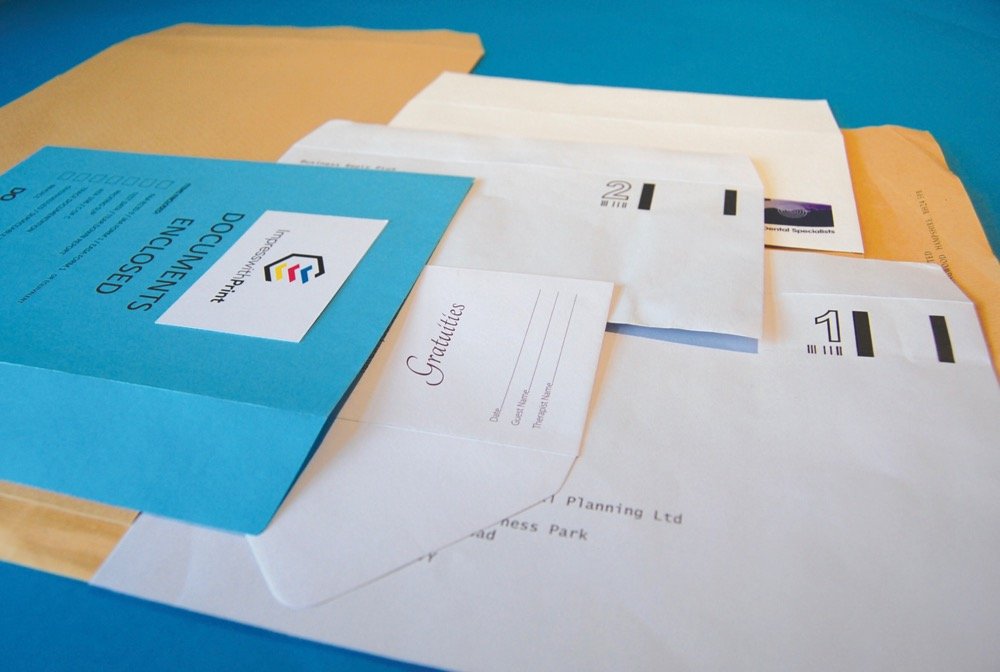
Either Spot Colour or Process Colour (CMYK) can be used to overprint your envelopes, depending on your requirements. (To learn more about the differences between the 2 colour processes, please see here – Spot and Process Colour Explained).

Generally the most common of “office” envelopes. Sized to take a sheet of A4 paper folded twice, ideal for invoices, statements and general letters.Available with a choice of window sizes and positions (including right hand windows), Peel & Seal or Self-Seal closures are the most popular for ease of sealing.

This is sized to take either an unfolded A5 sheet of paper or A4 folded in half.
As with many of the typical office envelopes, more commonly supplied as either Self-Seal or Peel & Seal and with growing popularity for premium paper weights or more vibrant colours.
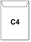
Designed to take an A4 sheet unfolded, C4’s are ideal for ensuring that your business correspondence or marketing literature arrives un-creased and professionally presented.
Available in a variety of paper grades including our Premium and Optimum ranges to enhance your professional appearance.
When specifying standard envelope sizes the second dimension denotes the opening style and flap length e.g.
DL Wallet = 110mm x 220mm – flap is on the 220mm edge
C5 Pocket = 228mm x 162mm – flap is on the 162mm edge
C4 Pocket = 324mm x 229mm – flap is on the 229mm edge
[wpanchor id=”envelope”]
C series Envelope sizes
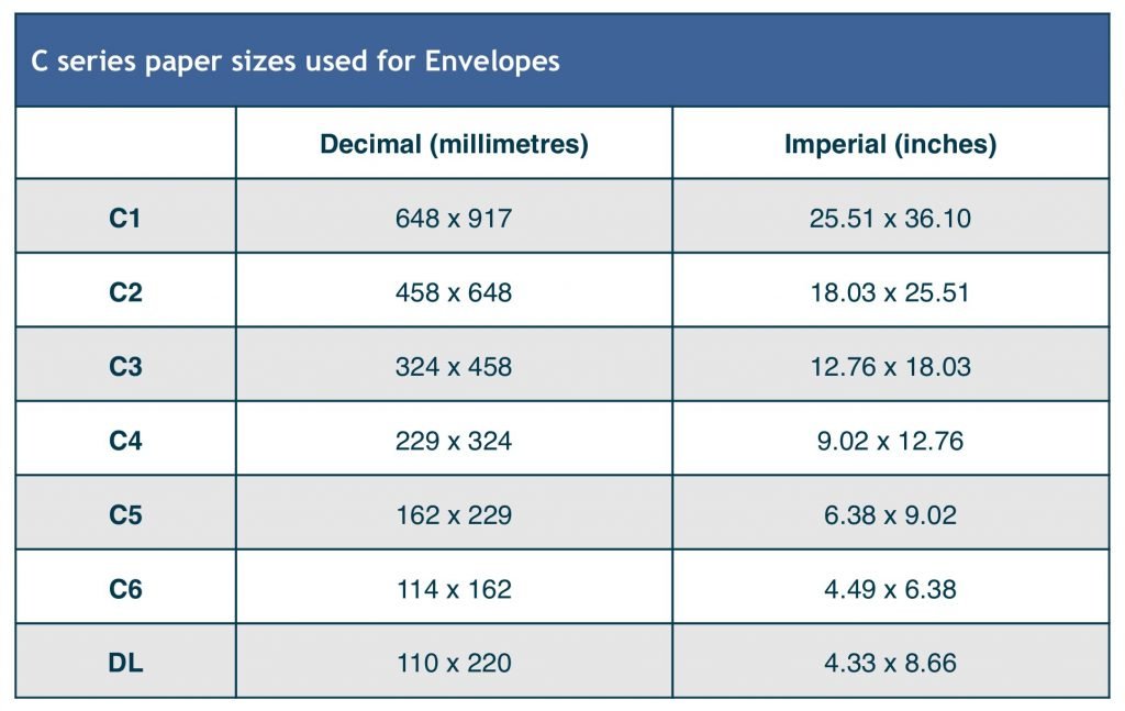
See here for standard Paper Sizes UK
Envelope FAQ’s
Can you explain what you mean about spot colour and process colours?
Will the flap affect the artwork shown on the envelope front?
This point has to be considered when starting your design. Small runs (of a few thousand envelopes) are printed with the envelope already made up, whereas longer runs we would print the details first, and then the envelope is made up after.
If your artwork bleeds over the edge of the envelope then please contact us first and we’ll advise on which side of the envelope we need a small clear margin, to enable the press to grip the envelope without touching the wet ink.
Will the colour(s) I see on a PDF proof print exactly as I see them onscreen?
Generally, no! Some colours are fairly representative whereas others are a long way off. The monitor you view your proof on is a device that mixes colours using red, green and blue (RGB). Without getting too technical, if your monitor has not been calibrated to display a Pantone® colour, then it’s unlikely you will see an accurate representation.
If choosing one or more specific spot colours (for branding purposes etc.) then it’s essential the colours are chosen from a printed Pantone® swatch, unless you know your screen is accurately calibrated.
An example – if you were to select Pantone® Violet in your graphics program, it’s very likely that this will show as a ‘blue’ onscreen. If you were then to look at Pantone® Violet in a Pantone® swatch you’ll see that the true colour is actually a rich purple. It follows that if you’d selected this colour for your design from what you see onscreen (blue), then it’s very likely that you won’t be happy with the final printed results (purple).

