How to create a Professional Blog Template Design
Step 1:
Let’s start out by creating a new file. I used a 1024 x 950 pixels canvas set at 72dpi, and I filled my background with a black colour.
Now insert a dark wooden background into your canvas, grab the design <here>. When you insert the background design into your canvas it should have its own layer, stretch it down at the bottom of your canvas.
Step 2:
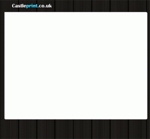
Select the Horizontal Type Tool and set the font family to Britannic Bold (click to download) , regular, 36 pt, strong and white colour shade. In a new text layer type your website name on top of your canvas. If you want you can change the colour to #59DEFF colour shade.
Step 3:
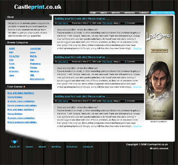
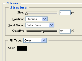
In a new layer draw a large white rounded rectangle just below your website name. This will be the body of the template. Then under Layer Style (Layer > Layer Style) add a Stroke blending option.
Step 4:
Now create the design for the left sidebar. First make a new layer set and name it ‘About’. In a new layer draw a black rectangle with 268 x 29px dimensions on top corner of your white body.
Step 5:
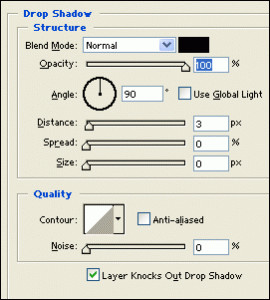
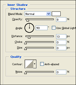
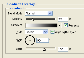
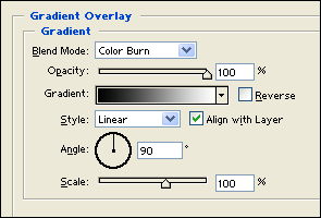
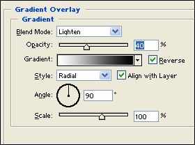
Under Layer Style (Layer > Layer Style) add a Drop Shadow, Inner Shadow and Gradient Overlay blending options to the black rectangle layer.
Step 6:
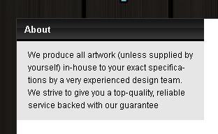
Select the Horizontal Type Tool and set the font family to Arial, bold, 13 pt, none and white colour shade. In a new text layer type the title of your first sidebar section, in this case ‘About us’.
Step 7:
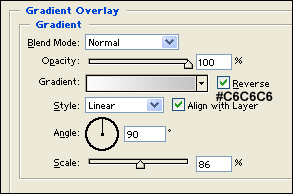
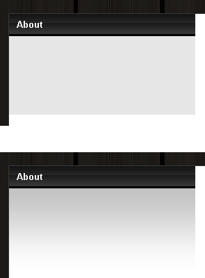
In a new layer draw a gray rectangle with 268 × 116px dimensions and #E6E6E6 colour shade below the title tab of your sidebar section. Then under Layer Style (Layer > Layer Style) add a Gradient Overlay blending option.
Step 8:
Now add the content of your ‘about us’ section.
Step 9:
Add more sidebar sections using the same designs. In this blog I added a section for Categories and Latest Content.
Step 10:
In a new layer set titled ‘Center Content’ add the same section design from the sidebar on the center body.
Step 11:
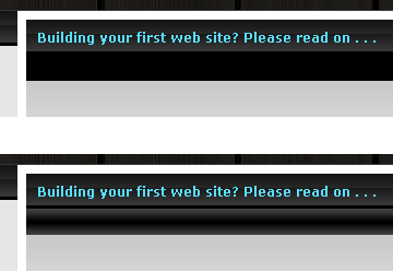
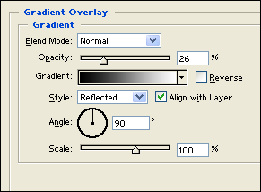
Since the center content section requires more space for details, create a new layer and draw a black rectangle with 552 × 24px dimensions. Then under Layer Style (Layer > Layer Style) add a Gradient Overlay blending option.
Step 12:
Now add text details such as author name, date, type of category or anything you want to add. Use font Arial, regular, 11 pt, none, white for text colour and #59DEFF colour shade for links.
Step 13:
Add more content section on the center.
Step 14:
On the right side of your white body leave a space for a skycraper advertisement banner.
Step 15:
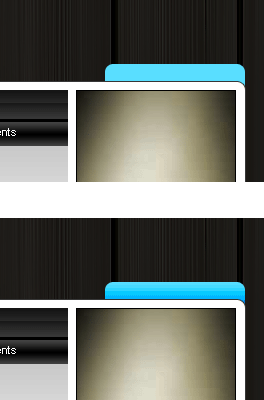
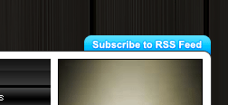
Now add a navigation interface above your white body. First select the Rounded Rectangle Tool and above your screen under the options palette choose Fill Pixels, set the radius to 10 px and check anti-aliased. Create a new layer and draw a rounded rectangle with 142 × 28px dimensions and #59DEFF colour shade. Make sure you position the rounded rectangle layer behind the white body layer.
Step 16:
Under Layer Style (Layer > Layer Style) add a Gradient Overlay blending option to your rounded rectangle tab layer.
Step 17:
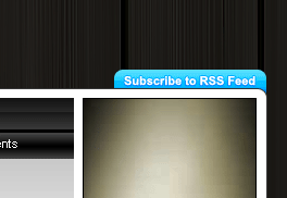
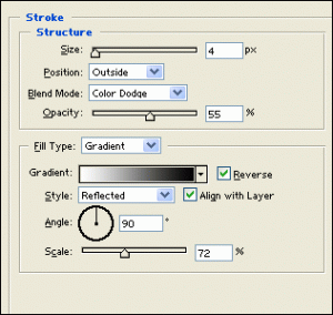
Select the Horizontal Type Tool and set the font family to Arial, bold, 11 pt, strong and white colour shade. In a new text layer type ‘Subscribe to RSS Feed’. Then under Layer Style (Layer > Layer Style) add a Stroke blending option to your text layer on the blue tab.
Step 18:
Next to your RSS tab create the same style of tab but use #767676 colour shade for colour.
Step 19:
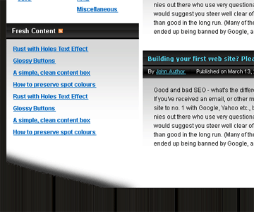
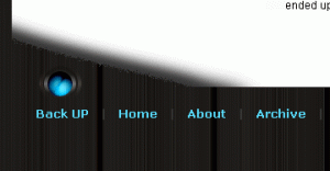
On your layers palette select the white rounded rectangle(body) from step three. Then select the Eraser Tool with a large soft brush and erase some parts on the bottom left corner of the large rounded rectangle.
Step 20:
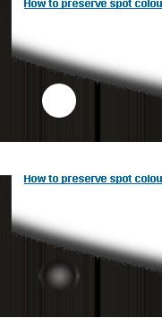
Now add your footer, first make a new layer set and name it Footer Design. In a new layer draw a white circle below the erased parts of the white rounded rectangle.
Under Layer Style (Layer > Layer Style) add a Gradient Overlay and Stroke blending options to the your white circle layer. Then set the layer’s blending mode to Darken.
Step 21:
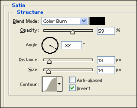
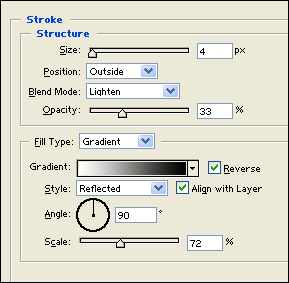
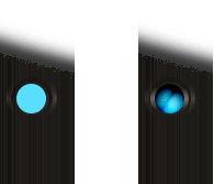
Now create a smaller circle with #59DEFF colour shade. Then under Layer Style (Layer > Layer Style) add a Satin, Gradient Overlay and Stroke blending options. Also set the layer’s blending mode to Soft Light.
Step 22:
Finish it off by adding your navigation links at the bottom and copyright information at the other end of the footer.
Results:








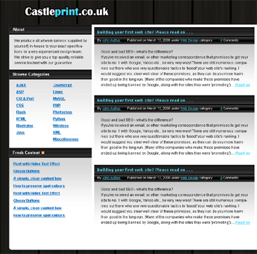



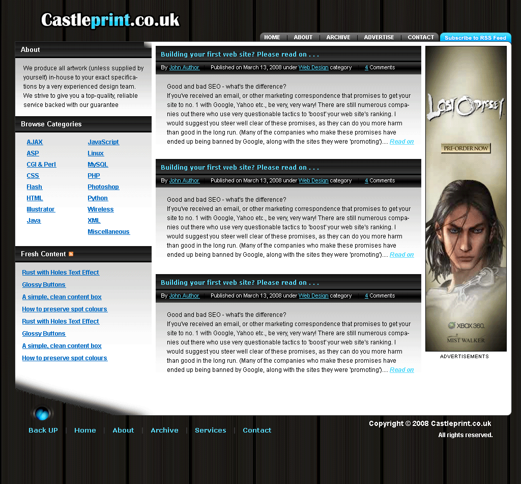
nice way to explain professional blog template design.